

"FlowFit" is still in development, but acts a proof of concept app that examines a cross-over between "FemmeTech" and "Fitness" markets. Combining cycle tracking with physical and mental health and wellness, people who menstruate would be able to anticipate when their high and low energy periods would be as it related to hormone cycling.
Date:
January 1, 2026
Topic:
Health App Design
Built in:
Figma
Process Overview
Initial Phase
FlowFit started as a sketch created while "down for the count" with symptoms of my own condition. Being an overall active person who absolutely loves being in the outdoors especially swimming, hiking, and skiing, understanding my cycle and when energy levels would be low or risk of strain is high would be invaluable. So I started sketching ideas for what an app combining the two would look like. The ideas got pretty wild pretty quickly and, while innovative and interesting, not necessarily best for a broader user-base, so I went back to the basics: market research and investigation.
From there, I found the most important element to consider when combining these two industries would be data privacy. This day and age, users are more aware than ever of the importance of maintaining the safety of their private information, so regardless of how the underlying app was designed, it would need to be carefully locked behind biometric verification systems and follow the lead of companies like Apple which push for this kind of personal data to be held locally on the device and inaccessible to anyone beyond the user. These considerations are important to the overall design of the app and should be taken into account from the beginning.
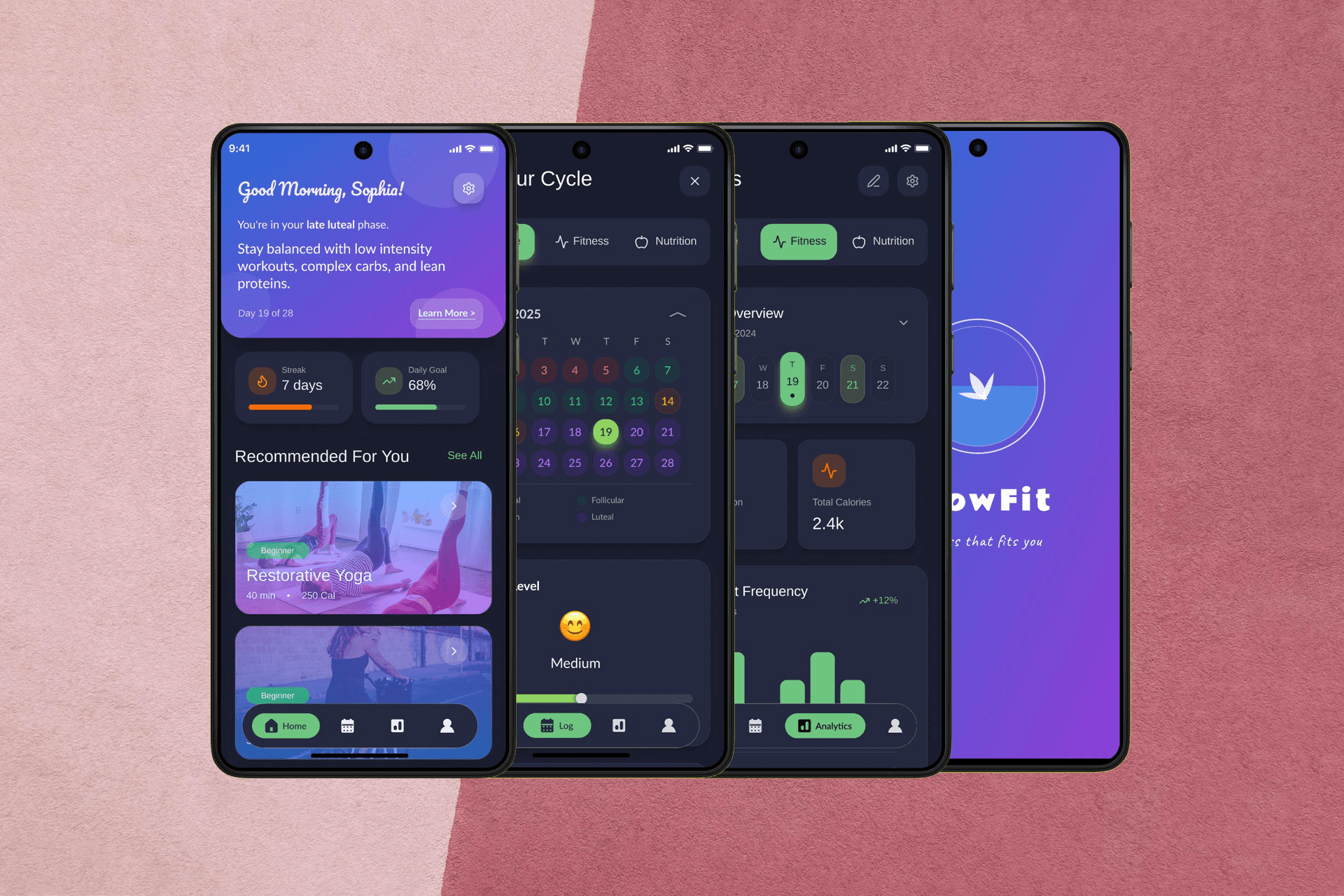
In doing this, early wireframes featured options for limited personal information on the dashboard and fully customisable dashboards with tiles a user could move, add, or remove to not only improve their specific experience but protect data to their own satisfaction. When performing initial testing, a happy medium came into focus where the amount of personal information on the homepage was minimal but still easily accessible to the user. The majority of participants expressed that having the biometric verification would be enough to provide a level of privacy when initially opening the app and still allow for quick, easy access to the stage of their cycle and recommendations for activity and nutrition on the dashboard. Having reworked the wireframes with participant input and re-tested with low fidelity prototypes, I moved on to the mid and high fidelity stages.
High Fidelity + Usability Testing
In the high fidelity stage, the app really began to shine and made me optimistic for the ways it could help with scheduling around conditions like endometriosis and PCOS and improve overall quality of life by changing the mentality to finding ways to work with it, when possible, and pre-emptively treat or prepare for symptoms when it is not possible. This would allow for some amount of control for users experiencing these conditions day-to-day and give them a boost alongside their medical treatment.
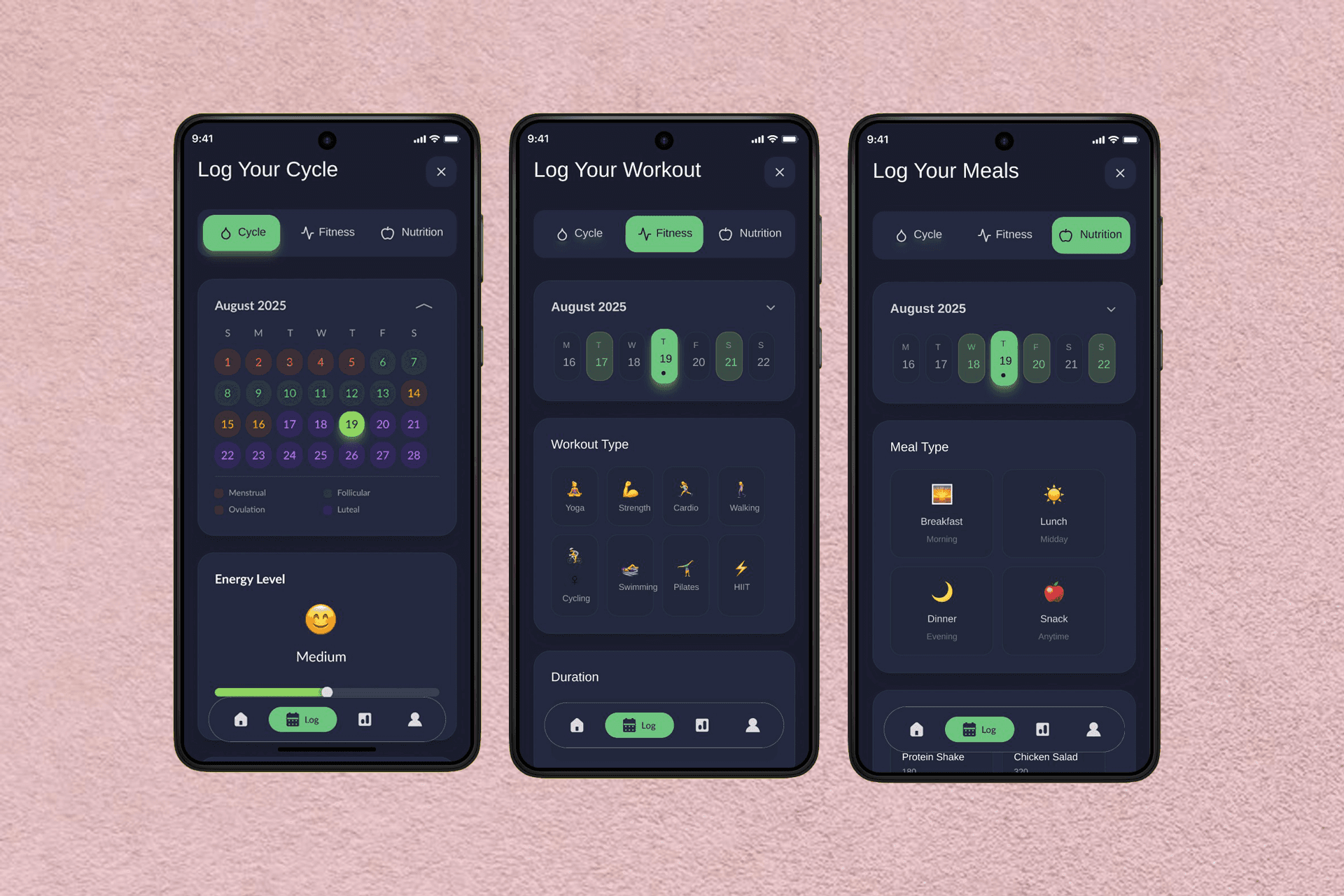
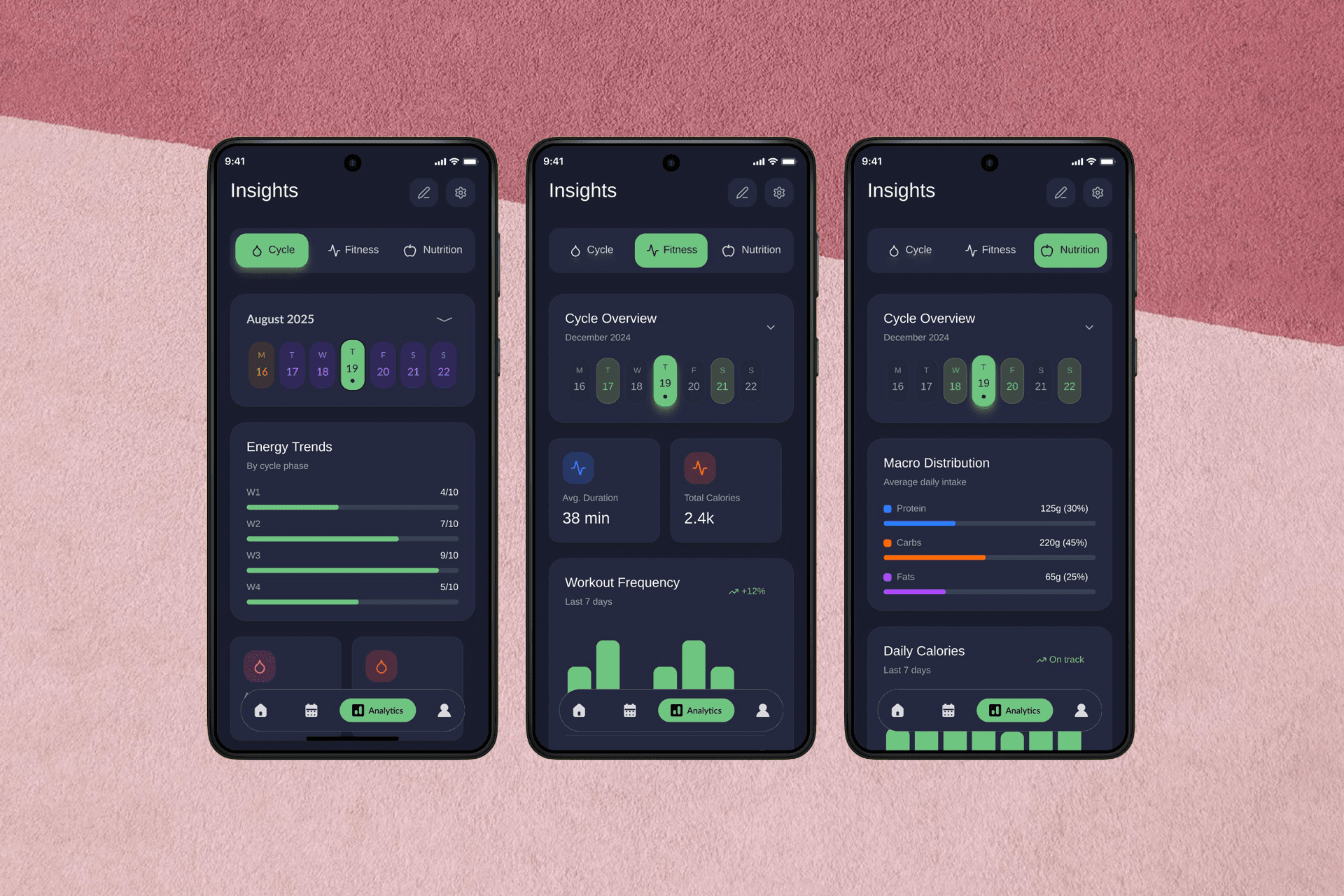
Given participant feedback during testing stages, the application features gender-neutral language, customisable logging pages, and the option to hide specific elements to accommodate users with different needs or triggers related to sexual health, nutrition, and physical activity. The current version is undergoing testing including tests to select a more permanent and accessible colour scheme as its current scheme adheres to WCAG 2.2 guidelines but still has room for improvement.