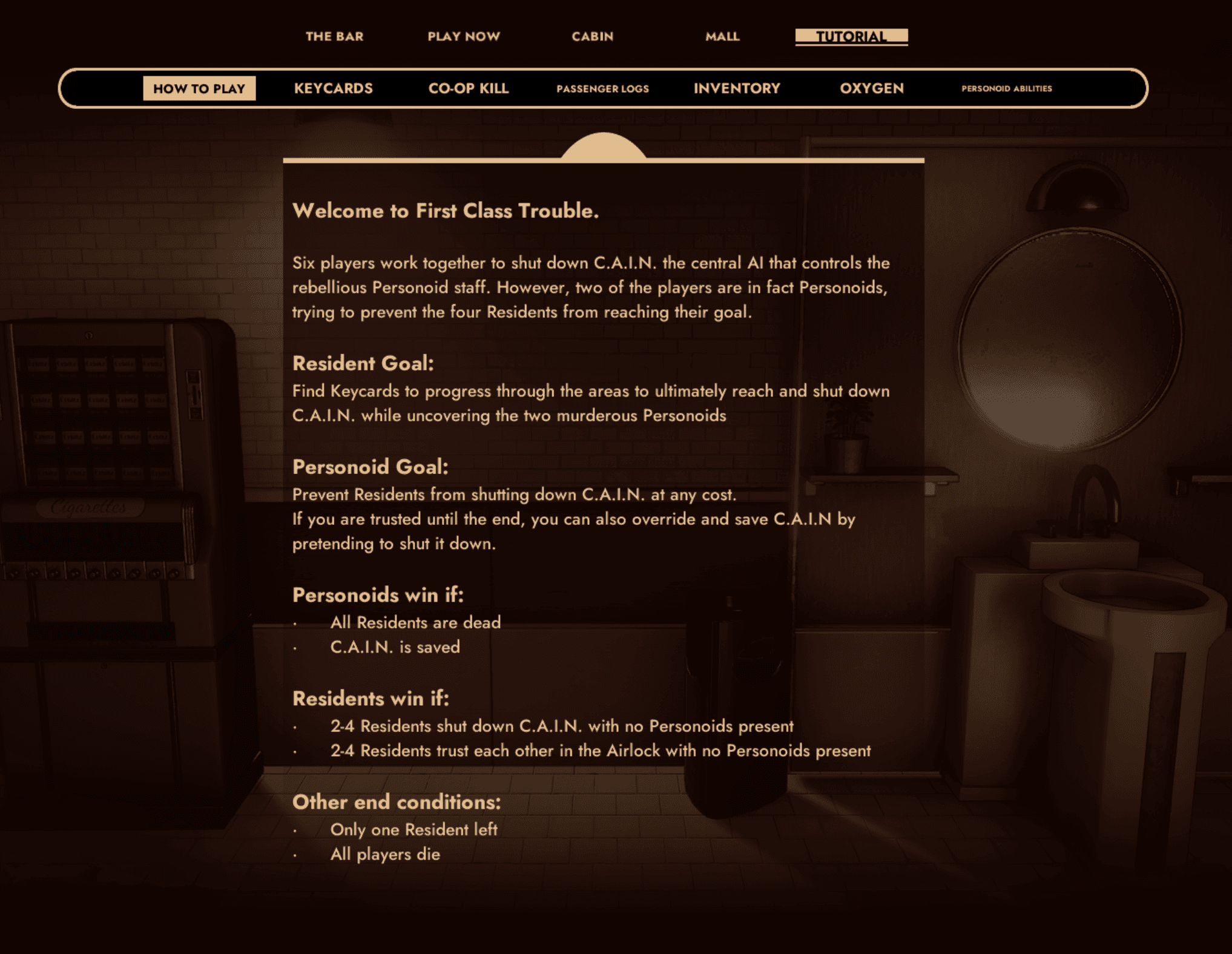
Accessibility in Gaming - First Class Trouble
Institution
Invisible Walls
Industry
Video Games
Tools
Role
Date
2024 to 2025
Time Frame
2024 to 2025

Overview
At Invisible Walls, I worked as a Junior UX Designer on First Class Trouble, a social deduction game where communication, clarity, and player trust are central to the experience.
Having previously collaborated with the team through my work at Versus Evil, I transitioned into a UX-focused role where I could directly shape how players interacted with the game.
My work centered on identifying friction in the player experience and improving accessibility across key systems. I conducted user testing sessions to evaluate onboarding, UI clarity, and moment-to-moment gameplay interactions. From these sessions, I identified usability issues and accessibility gaps, then translated findings into actionable design improvements.
Working closely with developers and designers, I contributed to refining HUD elements, menus, and interaction feedback to make the experience more intuitive especially for new players. I also supported the implementation of accessibility features, helping ensure the game could be enjoyed by a wider range of players.
This role strengthened my ability to advocate for users, communicate insights clearly, and design within the constraints of a live production environment.
Some of the improvements made during my time working on FCT included:
improving readability of text in menus
improving identifiability and differentiation of controls during play
added toggle for camera shake after new event was added that could potentially aggravate certain conditions
improved colour blind accessibility in rings mini game
improved interaction with accessibility aids
increased contrast between text and background colour in menus
Adding a more accessible tutorial
A majority of the accessibility improvements were integrated into the game, maintaining clean and aesthetically relevant menus that match the feel of the game and improve broader user experience without needing a host of additional set-up. This integrated style was a hit with players, and tested very well in official user testing sessions as well as in feedback after release. There were and still are many improvements to make, but my time with Invisible Walls taught me so much about accessibility in the video game industry and I'm proud of what the team accomplished and continues to accomplish as the game develops further.
Tutorial Change
One element that was changed to better accommodate a wider variety of player needs was the addition of a tutorial in the launch menu. Prior to this addition, the only way to learn how to play the game was through in-game prompts on screen during active rounds. This resulted in many new users feeling unprepared and isolated when starting out. The initial proposal for a tutorial was one that was partially playable in the lobby.
It was structured as an interactive museum that allowed players to learn how different elements worked before the game started. However, in testing we discovered it needed a partner that allowed for users, especially those with concerns surrounding reading and comprehension speed, to learn the game at their own pace. While the interactive element was received positively, we learned that having it accessible in the lobby simply didn't leave new players enough time to learn what they needed to feel comfortable. Users also felt the text provided in the practice area was too limited to fully explain everything they needed.
Initially, trying to preserve the playable element, we tried expanding lobby time limits and making it so a unanimous vote was necessary to proceed instead of just the lobby leader. This was also received positively, but still didn't meet the needs of all users. After a deep discussion as a team, we opted to give our players the best of both worlds. We added an area for players to learn all of the text-heavy information necessary to play before joining a match and made it easy to find on the launch screen. We maintained the interactive version in the lobby, kept improvements, and made more to ensure all users would be able to start a game with confidence and enjoy their time aboard the ISS Alithea. Below you can see a brief sample of some of the original onscreen prompts that were the only form of tutorial before the change as well as the sample of the text tutorial added as a result of our user outreach and testing.
Concept & Objectives
The campaign was built around three core goals:
Demonstrate that gaming communities can drive positive impact
Establish a scalable framework for future charity-driven events
Expand awareness of First Class Trouble to new audiences
Rather than treating these as separate goals, we approached the campaign as a unified experience, where engagement, entertainment, and contribution were seamlessly connected.
Experience Design Approach
To bring this to life, Versus Evil partnered with Paws Your Game. Together, we designed a two-week live event that functioned as both a fundraiser and a large-scale interactive campaign.
My role focused on shaping how users would experience the campaign across multiple touchpoints:
Designing thematic visual assets (tickets, promotional graphics, overlays) that reinforced the cruise-ship fantasy
Supporting engagement loops that encouraged viewers to participate, donate, and share
Considering user flow across platforms, from social discovery to livestream engagement to charitable contribution
The event featured a continuous schedule of content from streamers, influencers, and creators across platforms like Twitch and YouTube. Each participant became part of the broader experience, helping to maintain momentum and create a sense of an ongoing, shared event.
To further drive engagement, the campaign included:
Company-funded giveaways to reward participation
Social media amplification to increase visibility and reach
Sponsorship coordination to support fundraising goals
Design Challenges
One of the key challenges was maintaining consistency across a highly distributed event. With multiple creators, platforms, and time zones involved, the campaign needed a strong visual and experiential identity that could remain recognizable regardless of where or how users engaged with it.
Additionally, designing for a live, two-week event required flexibility. Assets needed to work in a variety of contexts, from livestream overlays to social posts, while still feeling cohesive and intuitive to audiences encountering the campaign from different places. For this, we created a set of assets and a colour scheme that fit both organisations and the game. We pushed these elements out to all participants but gave them the flexibility to make their own overlays for events and posts to help balance individual community aesthetics with those present in the event. We required approval prior to posting or streaming with self-made overlays, but also provided templates that could be edited appropriately and posted with minimal oversight to offer a streamlined experience for those who were interested in that approach.

Outcomes & Impact
The campaign successfully brought together players, creators, and communities in a shared experience that combined entertainment with charitable giving. It demonstrated how thoughtfully designed interactive campaigns can:
Encourage meaningful audience participation
Strengthen community connection around a game
Extend a game’s identity beyond gameplay into broader cultural experiences
It also helped establish a foundation for future collaborations of this kind, showing the potential of live, creator-driven campaigns as both marketing tools and community-building platforms. At the end of the campaign, we surpassed our $7,000 realistic goal as well as our $15,000 stretch goal and managed to raise just under $20,000 for charity with this campaign. We also saw a notable increase in game downloads and player activity during and in the month following the event.